
情境
Google 出了一個新的 Layout 叫做 TextInputLayout,可以讓你在操作 EditText 的時候使用者體驗更佳,它提供了許多方便的操作方法跟動畫。
完整程式碼
你可以到 GitHub 上面下載或觀看完整程式碼。
程式碼說明
import library
一開始當然要先把 library 加到專案內,調整到 Android 所對應的版本。
implementation 'com.google.android.material:material:1.0.0'
接著就可以在 layout 內使用它了。
操作方式
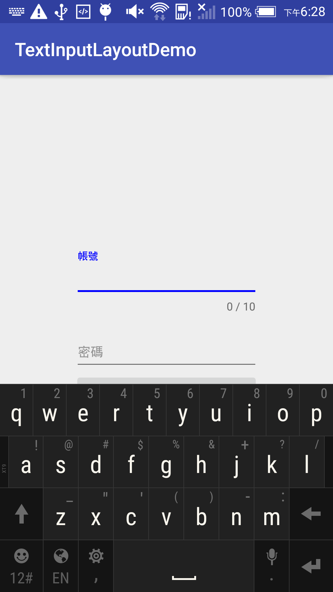
我們來模擬做一個登入畫面,Layout 的布局如下。
<?xml version="1.0" encoding="utf-8"?>
<RelativeLayout xmlns:android="http://schemas.android.com/apk/res/android"
    xmlns:app="http://schemas.android.com/apk/res-auto"
    android:gravity="center"
    android:layout_width="match_parent"
    android:layout_height="match_parent">
    <android.support.design.widget.TextInputLayout
        android:id="@+id/account_layout"
        android:layout_width="200dp"
        android:layout_height="wrap_content">
        <EditText
            android:id="@+id/account_edit"
            android:hint="@string/account"
            android:textSize="15sp"
            android:textColor="#000000"
            android:layout_width="match_parent"
            android:layout_height="wrap_content" />
    </android.support.design.widget.TextInputLayout>
    <android.support.design.widget.TextInputLayout
        android:layout_below="@id/account_layout"
        android:id="@+id/password_layout"
        android:layout_width="200dp"
        android:layout_height="wrap_content">
        <EditText
            android:id="@+id/password_edit"
            android:hint="@string/password"
            android:textSize="15sp"
            android:textColor="#000000"
            android:layout_width="match_parent"
            android:layout_height="wrap_content" />
    </android.support.design.widget.TextInputLayout>
    <Button
        android:layout_below="@id/password_layout"
        android:text="@string/login"
        android:id="@+id/login_button"
        android:layout_width="200dp"
        android:layout_height="wrap_content" />
</RelativeLayout>
你就會看到以下的畫面。

那這樣跟一般的 EditText 有甚麼差別呢?
它提供了許多方便的方法讓你操作以及流暢的動畫如以下動畫所示。

可以看到我們所設定的 `android:hint` 屬性,可以讓使用者點選 EditText 以後就變成提示標題,如果需要這樣的效果,透過原生的元件就必須自己來定義,相對會麻煩許多。
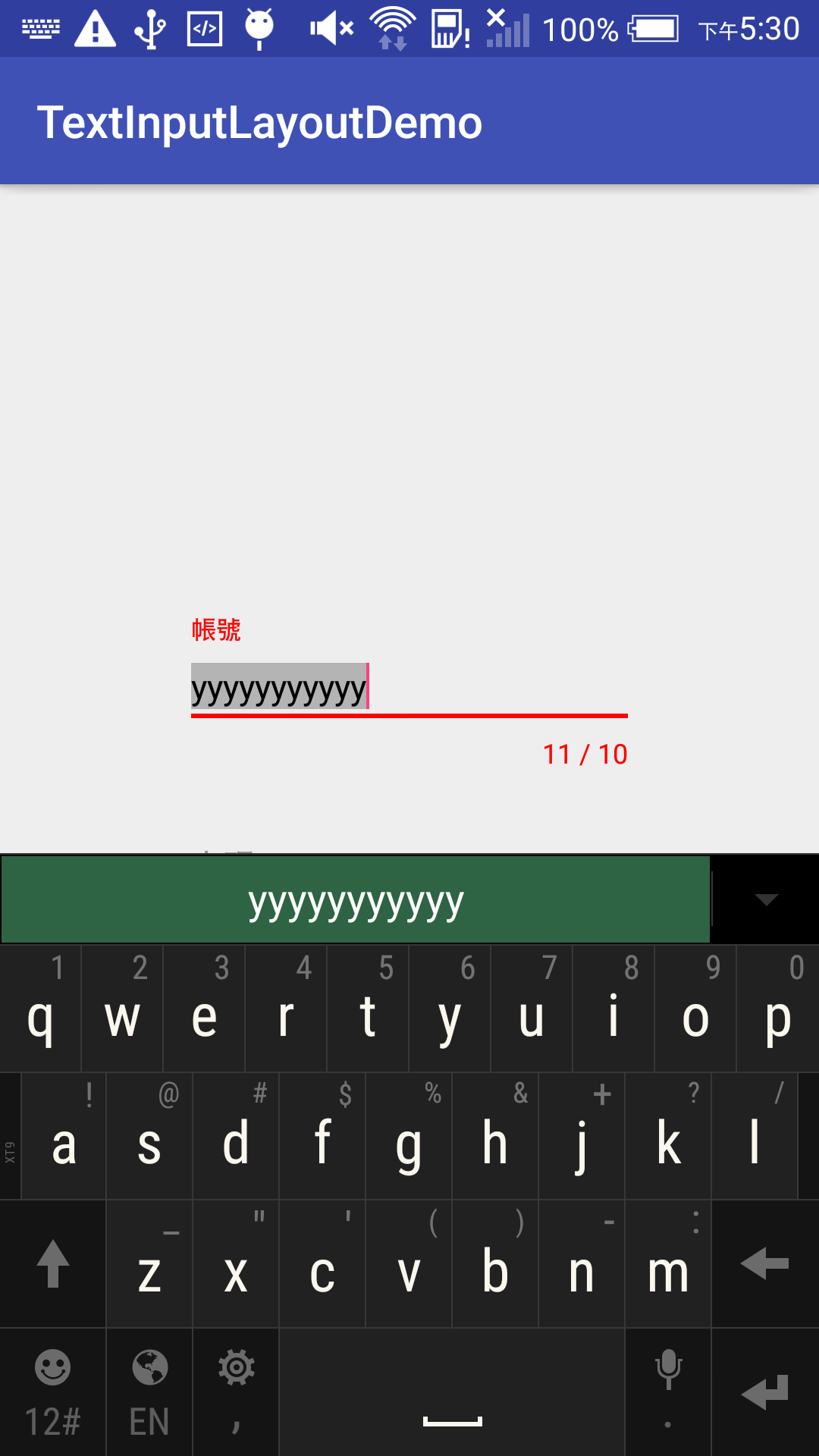
字數統計
TextInputLayout 還提供方便的輸入字數提示,只需要在 xml 內加入 app:counterEnabled 以及 app:counterMaxLength 這兩個屬性,就可以開啟限制字數的 UI 顯示。
<android.support.design.widget.TextInputLayout
        android:id="@+id/account_layout"
        android:layout_width="200dp"
        app:counterEnabled="true"
        app:counterMaxLength="10"
        android:layout_height="wrap_content">
當然你也可以在程式內設定,效果是相同的。
account_layout.counterMaxLength = 10
account_layout.isCounterEnabled = true

所以當我們設定好以後,試著將字數輸入超過限制字數就會變成紅色的字體來提示使用者。
顯示錯誤訊息
如果想要讓 TextView 出現顯示訊息,不用再透過 Toast 來表示了,TextInputLayout 提供了簡單的錯誤訊息提示的方法給開發者使用。
account_layout.isErrorEnabled = true
//...
login_button.setOnClickListener {
	if (account_edit.text.length > 10) {
		account_layout.error = "字數超過了"
	}
}
先開啟顯示錯誤訊息的開關 isErrorEnabled = true,只需要透過 setError 這個方法,就可以如下圖顯示出錯誤訊息。

改變外觀
我們可以透過宣告 style 的方式來改變外觀,先將顏色設定為藍色。
<style name="input_text_style" parent="Theme.AppCompat.Light.NoActionBar">
    <item name="colorAccent">#0000ff</item>
</style>
接著將這個 style 設定到 TextInputLayout 上面。
<android.support.design.widget.TextInputLayout
        android:id="@+id/account_layout"
        android:layout_width="200dp"
        app:counterEnabled="true"
        app:counterMaxLength="10"
        android:theme="@style/input_text_style"
        android:layout_height="wrap_content">
你就可以看到我們的 Hint 跟輸入框底線變藍色了。
如果你只是想改變 hint 的顏色,先宣告好 style 為綠色的。
<style name="input_text_style" parent="Theme.AppCompat.Light.NoActionBar">
    <item name="android:textStyle">bold</item>
    <item name="android:textColor">#00ff00</item>
    <item name="android:textSize">20sp</item>
</style>
那麼就可以透過 app:hintTextAppearance 這個方法來改變。
<android.support.design.widget.TextInputLayout
        android:layout_below="@id/account_layout"
        android:id="@+id/password_layout"
        android:layout_width="200dp"
        app:hintTextAppearance="@style/input_text_style"
        android:layout_height="wrap_content">
那麼你就會看到以下的畫面出現。

同樣如果你想修改錯誤訊息的外觀,也可以透過 app:errorTextAppearance 這個方法來進行修改,先宣告 style 為黃色的。
<style name="input_text_style" parent="Theme.AppCompat.Light.NoActionBar">
    <item name="android:textStyle">bold</item>
    <item name="android:textColor">#ffff00</item>
    <item name="android:textSize">20sp</item>
</style>
接著設定在 password 的 layout 上面。
<android.support.design.widget.TextInputLayout
        android:layout_below="@id/account_layout"
        android:id="@+id/password_layout"
        android:layout_width="200dp"
        app:hintTextAppearance="@style/input_text_hint_style"
        app:errorTextAppearance="@style/input_text_error_style"
        android:layout_height="wrap_content">
...
如此一來就可以輕鬆調整這些設定了。

這樣就是一個簡單的 TextInputLayout 範例。