
情境
如果你想要做一個開關的按鈕,也就是說點一下就顯示開啟再點一下就顯示關閉,那麼你就可以使用 ToggleButton。
程式碼說明
我們可以採用多種方式進行宣告,示範如下。
方法一
你可以直接在程式碼內宣告 ToggleButton,不需要在 XML 內進行任何宣告,主程式部分。
class MainActivity : AppCompatActivity() {
    override fun onCreate(savedInstanceState: Bundle?) {
        super.onCreate(savedInstanceState)
        setContentView(R.layout.activity_main)
        val toggleButton = ToggleButton(this@MainActivity)
        activity_main.addView(toggleButton)
    }
}
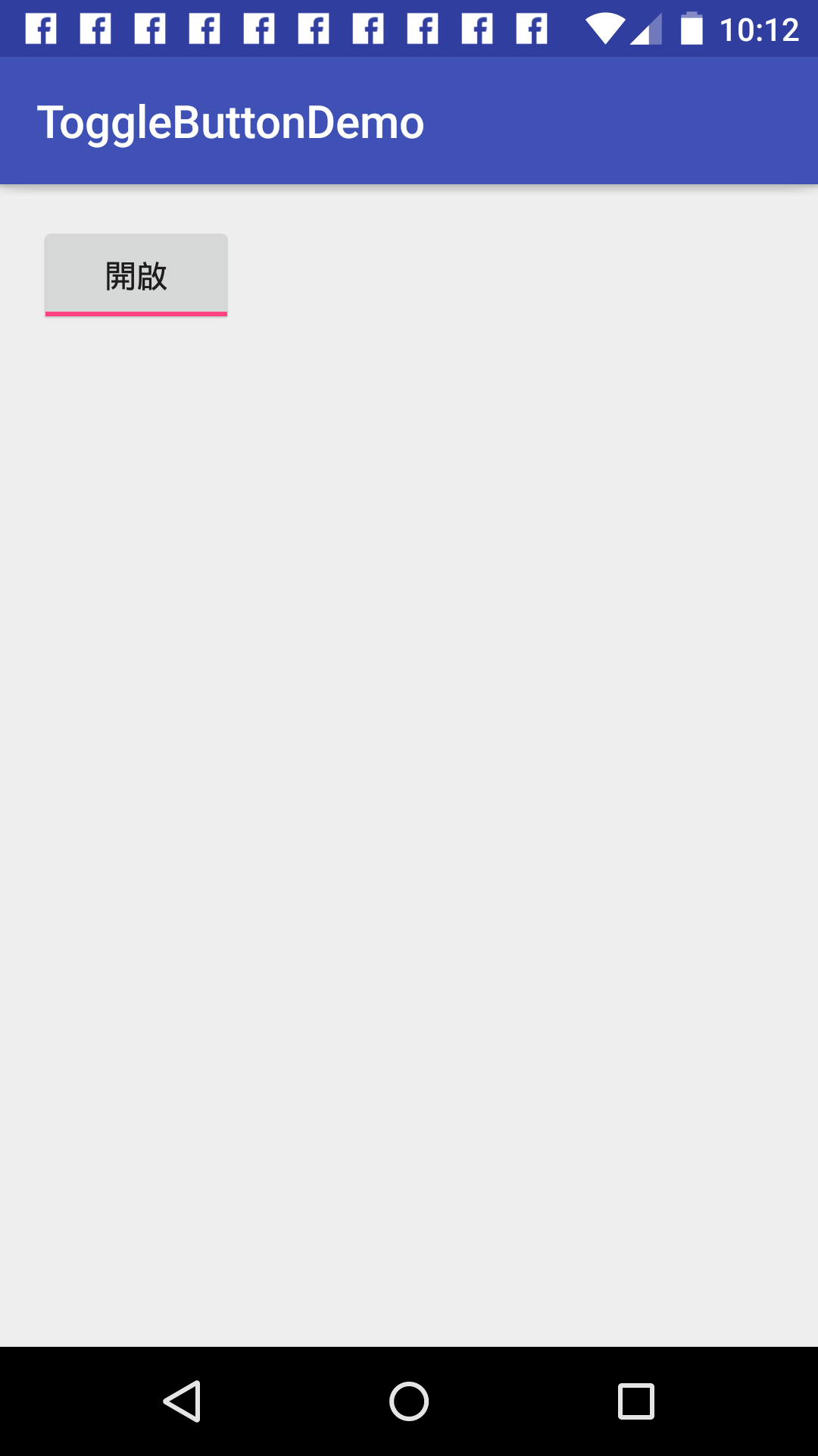
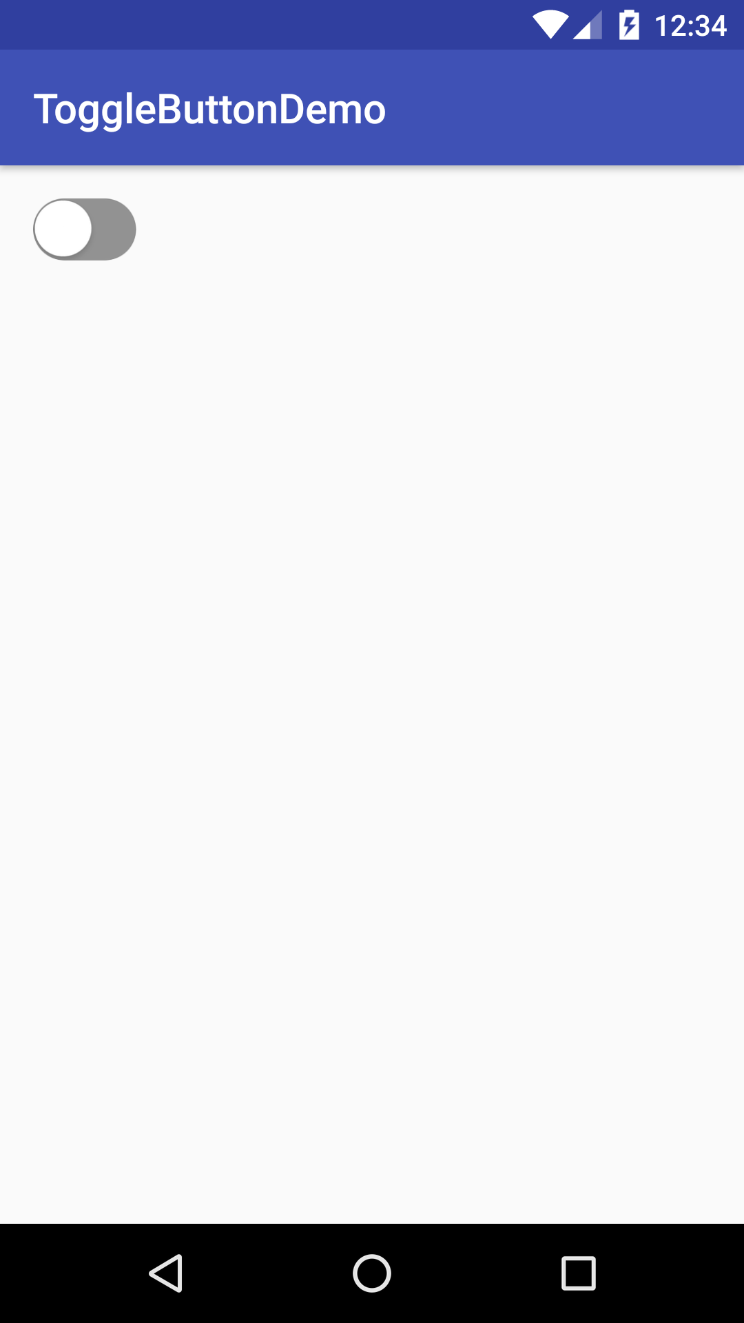
這樣你就可以看到如下圖,還沒按過的效果。

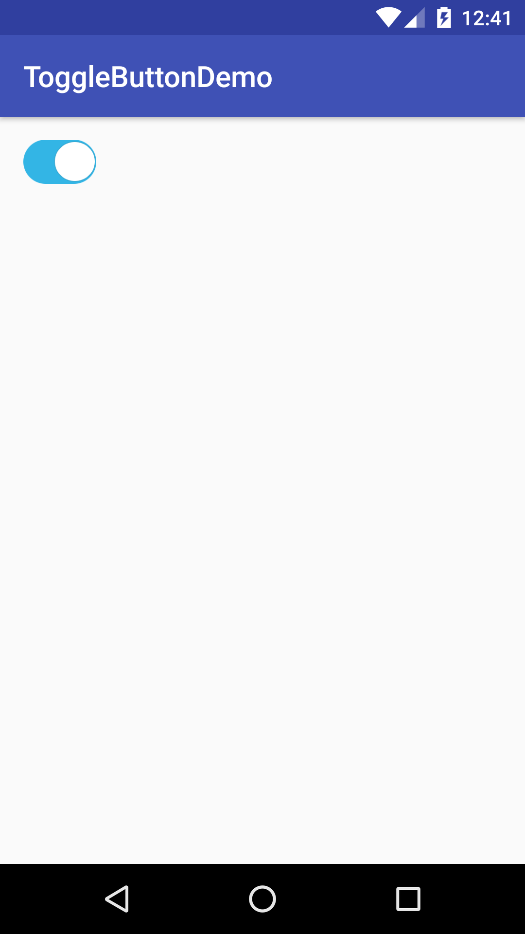
按下按鈕以後的效果就會長這樣。
但是,這樣做其實並不好管理,未來如果元件一多的話,整段程式碼就會變得很複雜,所以最好的方式是寫到
XML 上面去。
方法二
直接在XML上面進行宣告。
<?xml version="1.0" encoding="utf-8"?>
<RelativeLayout xmlns:android="http://schemas.android.com/apk/res/android"
    xmlns:tools="http://schemas.android.com/tools"
    android:id="@+id/activity_main"
    android:layout_width="match_parent"
    android:layout_height="match_parent"
    android:paddingBottom="@dimen/activity_vertical_margin"
    android:paddingLeft="@dimen/activity_horizontal_margin"
    android:paddingRight="@dimen/activity_horizontal_margin"
    android:paddingTop="@dimen/activity_vertical_margin"
    tools:context="com.example.givemepss.togglebuttondemo.MainActivity">

    <ToggleButton
        android:layout_width="wrap_content"
        android:layout_height="wrap_content" />
</RelativeLayout>
你就會看到跟上面宣告的效果是一致的。
還沒按過的效果。
按下按鈕以後的效果就會長這樣。
這樣不但方便管理佈局,而且畫面有所變動也不會影響到程式碼的運作。
- 注意:外觀會隨著Android版本不同而有所變化
事件處理
如果你想要對 ToggleButton 進行事件指派的話,有以下幾種方式可以選擇。
事件處理-方法一
你可以直接在 XML 宣告 android:onClick 屬性,接著在程式碼內進行事件方法的宣告,這邊要特別注意一下,宣告這個事件方法有以下幾個要注意的點:
- 該方法必須是 public。
- 該方法回傳值必須是 void。
- 該方法傳入的參數一定要是 View 的物件。
這樣才可以完成事件的連結。
首先在XML內進行宣告事件方法。
<?xml version="1.0" encoding="utf-8"?>
<RelativeLayout xmlns:android="http://schemas.android.com/apk/res/android"
    xmlns:tools="http://schemas.android.com/tools"
    android:id="@+id/activity_main"
    android:layout_width="match_parent"
    android:layout_height="match_parent"
    android:paddingBottom="@dimen/activity_vertical_margin"
    android:paddingLeft="@dimen/activity_horizontal_margin"
    android:paddingRight="@dimen/activity_horizontal_margin"
    android:paddingTop="@dimen/activity_vertical_margin"
    tools:context="com.example.givemepss.togglebuttondemo.MainActivity">

    <ToggleButton
        android:onClick="onTargetClick"
        android:layout_width="wrap_content"
        android:layout_height="wrap_content" />
</RelativeLayout>
接著我們要在主要程式內進行事件方法的宣告。
class MainActivity : AppCompatActivity() {
	override fun onCreate(savedInstanceState: Bundle?) {
		super.onCreate(savedInstanceState)
		setContentView(R.layout.activity_main)
	}

	fun onTargetClick(view: View) {
		val toggleButton = view as ToggleButton
		Toast.makeText(this@MainActivity, "${toggleButton.isChecked}", Toast.LENGTH_SHORT).show()
	}
}
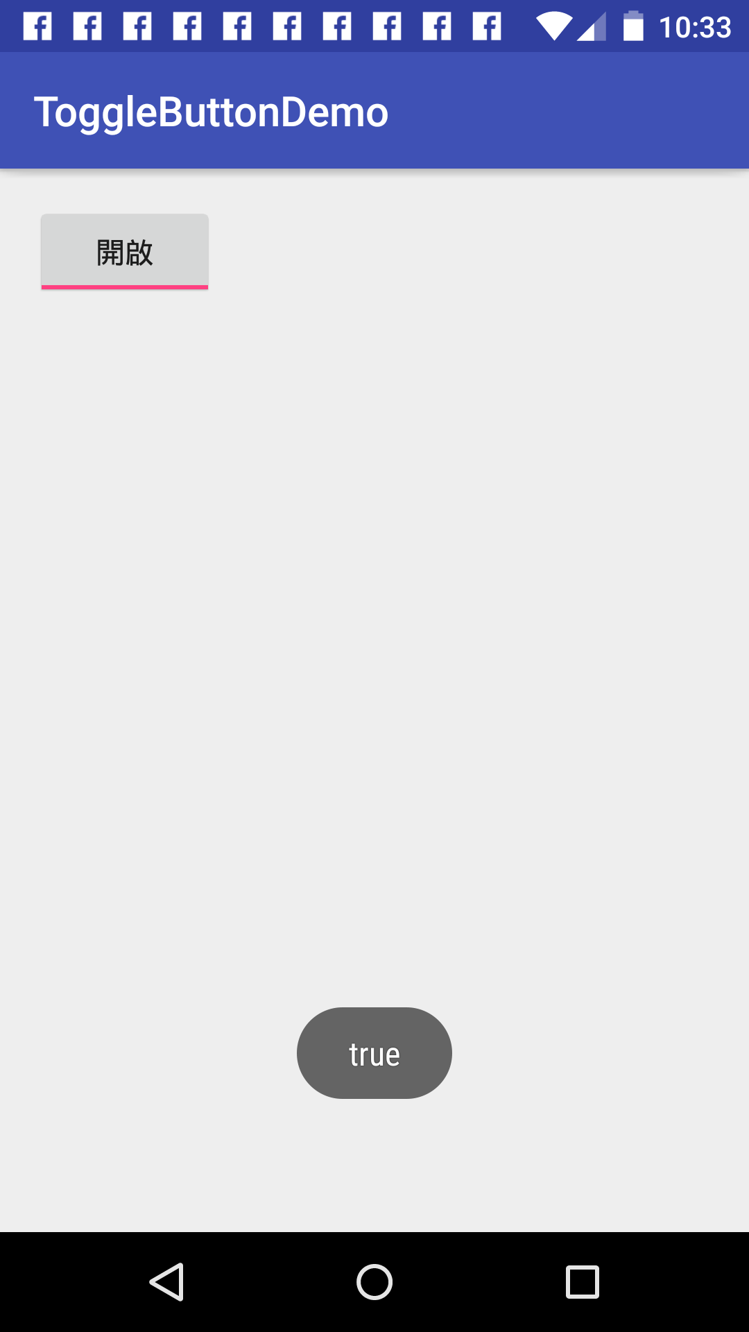
經過幾行簡單的設定以後,我們可以看到事件完成連結了,試著運行程式後就可以看到下面的圖所示。
當我們按下 ToggleButton 後,它就會顯示目前 ToggleButton 所呈現的值。

但是其實這樣並不好,為什麼?
因為我們把事件綁定在 xml,會造成程式碼不好追蹤的壞處,例如,如果我們的 xml 共用,有多個 Actvitiy 都有覆寫這個方法,那麼就會在追蹤code的時候,產生不知道是哪個xml所發出這個事件,可讀性就會大大降低,因此,我們如果改成將事件寫在程式碼內,對於後續的維護是會比較好的。
事件處理-方法二
首先我們在 XML 上面對 ToggleButton 給定 ID。
<?xml version="1.0" encoding="utf-8"?>
<RelativeLayout xmlns:android="http://schemas.android.com/apk/res/android"
    xmlns:tools="http://schemas.android.com/tools"
    android:id="@+id/activity_main"
    android:layout_width="match_parent"
    android:layout_height="match_parent"
    android:paddingBottom="@dimen/activity_vertical_margin"
    android:paddingLeft="@dimen/activity_horizontal_margin"
    android:paddingRight="@dimen/activity_horizontal_margin"
    android:paddingTop="@dimen/activity_vertical_margin"
    tools:context="com.example.givemepss.togglebuttondemo.MainActivity">

    <ToggleButton
        android:id="@+id/toggle_button"
        android:layout_width="wrap_content"
        android:layout_height="wrap_content" />
</RelativeLayout>
接著我們回到主要程式區去讓 ToggleButton 跟事件進行連結。
class MainActivity : AppCompatActivity() {
    override fun onCreate(savedInstanceState: Bundle?) {
        super.onCreate(savedInstanceState)
        setContentView(R.layout.activity_main)
        toggle_button.setOnCheckedChangeListener {
			buttonView, isChecked -> Toast.makeText(this@MainActivity, "ToggleButton is $isChecked", 		Toast.LENGTH_SHORT).show()
        }
  }
}
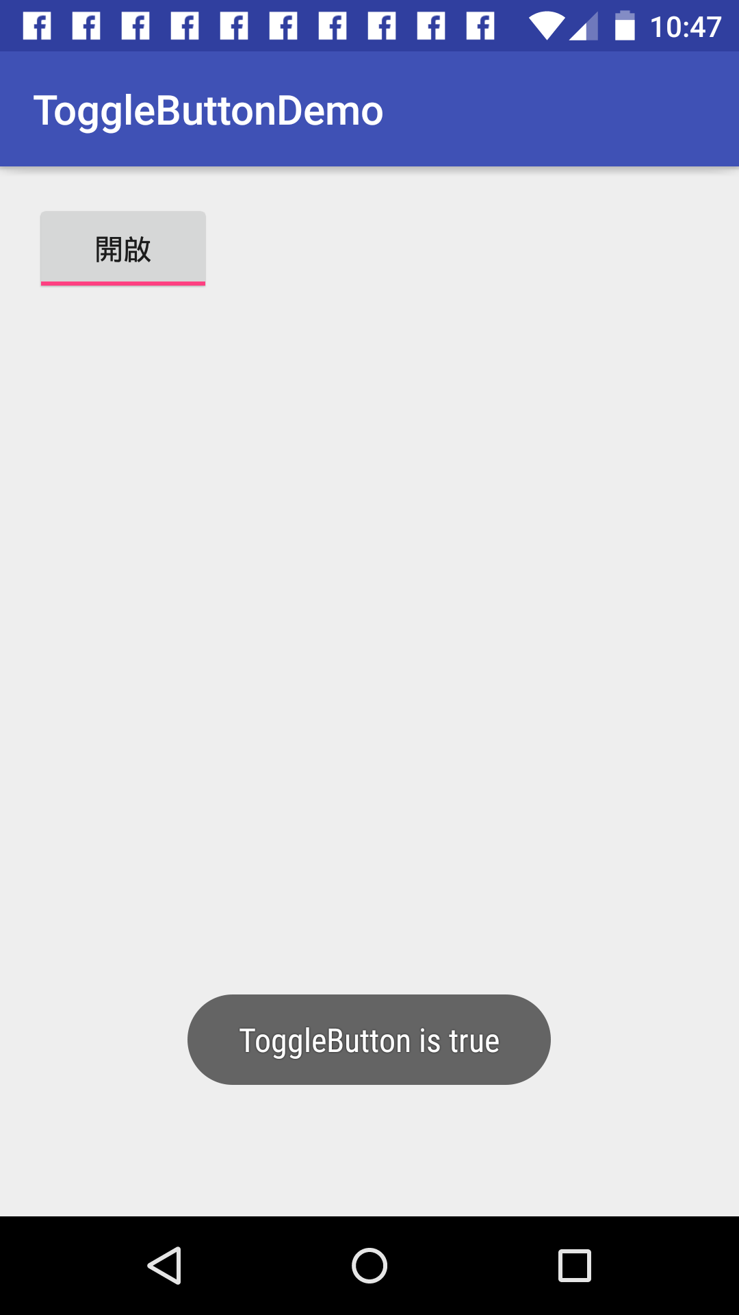
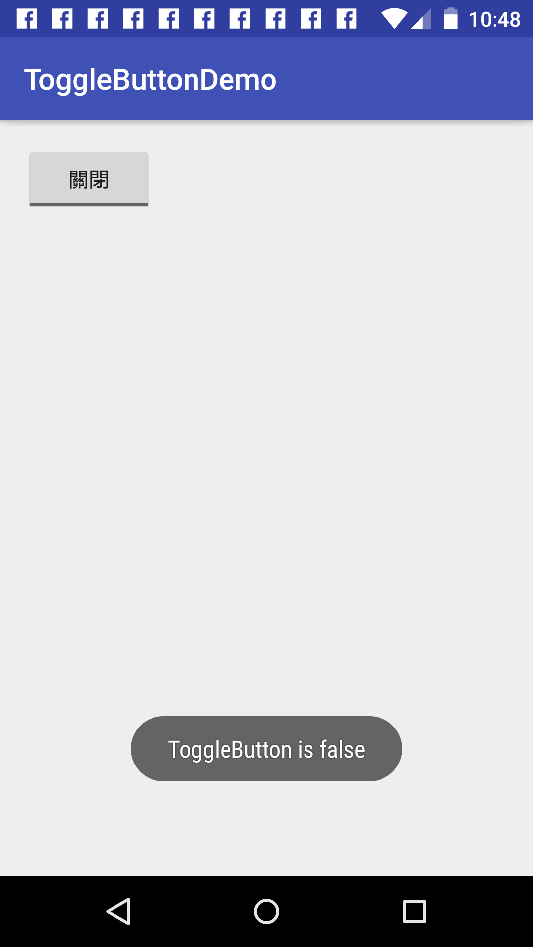
如此一來你就可以看到如下圖所示,當你按下 ToggleButton 就會顯示出目前值的 Toast。
多個事件處理
如果你想要處理多個事件,那麼就可以直接在程式區塊內進行 ID 辨識,首先,在 xml 內將每個 ToggleButton 標記上ID。
<?xml version="1.0" encoding="utf-8"?>
<LinearLayout xmlns:android="http://schemas.android.com/apk/res/android"
    xmlns:tools="http://schemas.android.com/tools"
    android:id="@+id/activity_main"
    android:layout_width="match_parent"
    android:layout_height="match_parent"
    android:paddingBottom="@dimen/activity_vertical_margin"
    android:paddingLeft="@dimen/activity_horizontal_margin"
    android:paddingRight="@dimen/activity_horizontal_margin"
    android:paddingTop="@dimen/activity_vertical_margin"
    android:orientation="vertical"
    tools:context="com.example.givemepss.togglebuttondemo.MainActivity">

    <ToggleButton
        android:id="@+id/toggle_button1"
        android:layout_width="wrap_content"
        android:layout_height="wrap_content" />
    <ToggleButton
        android:id="@+id/toggle_button2"
        android:layout_width="wrap_content"
        android:layout_height="wrap_content" />
</LinearLayout>
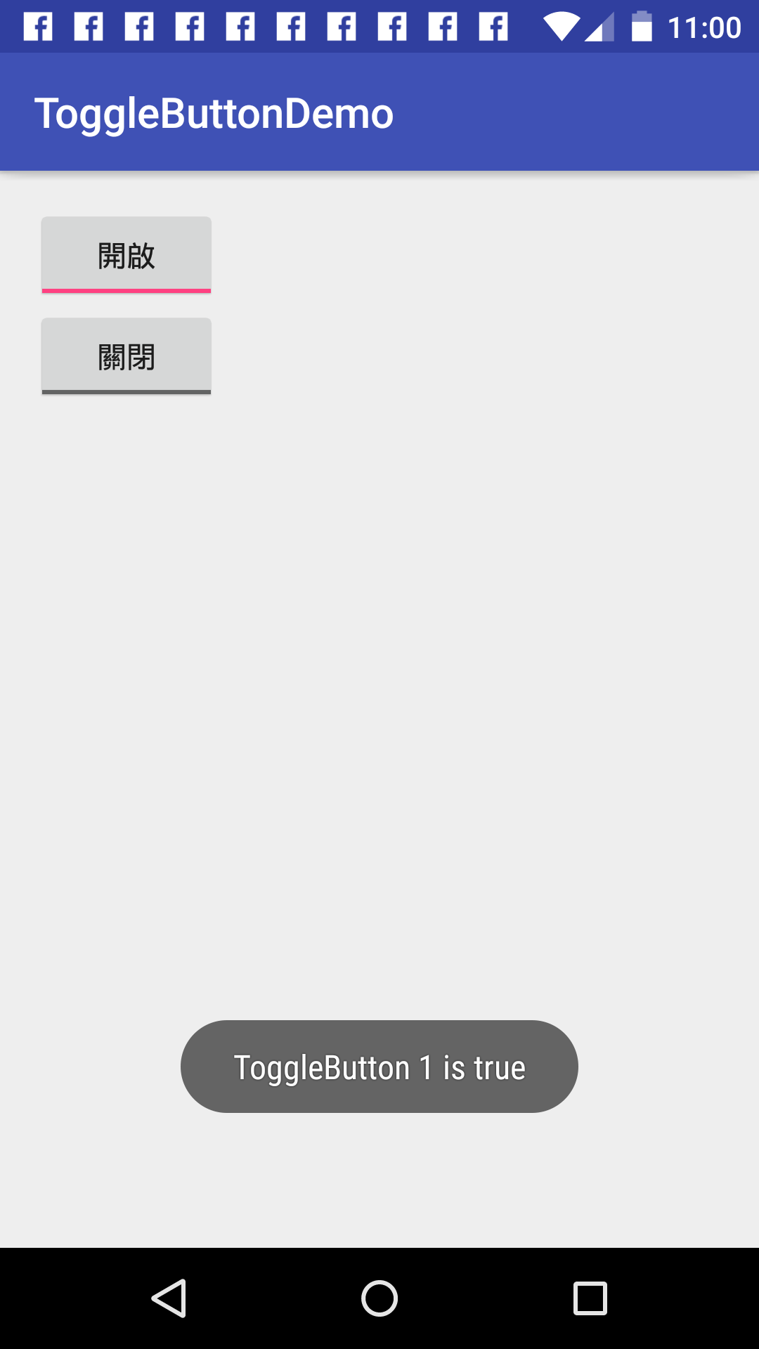
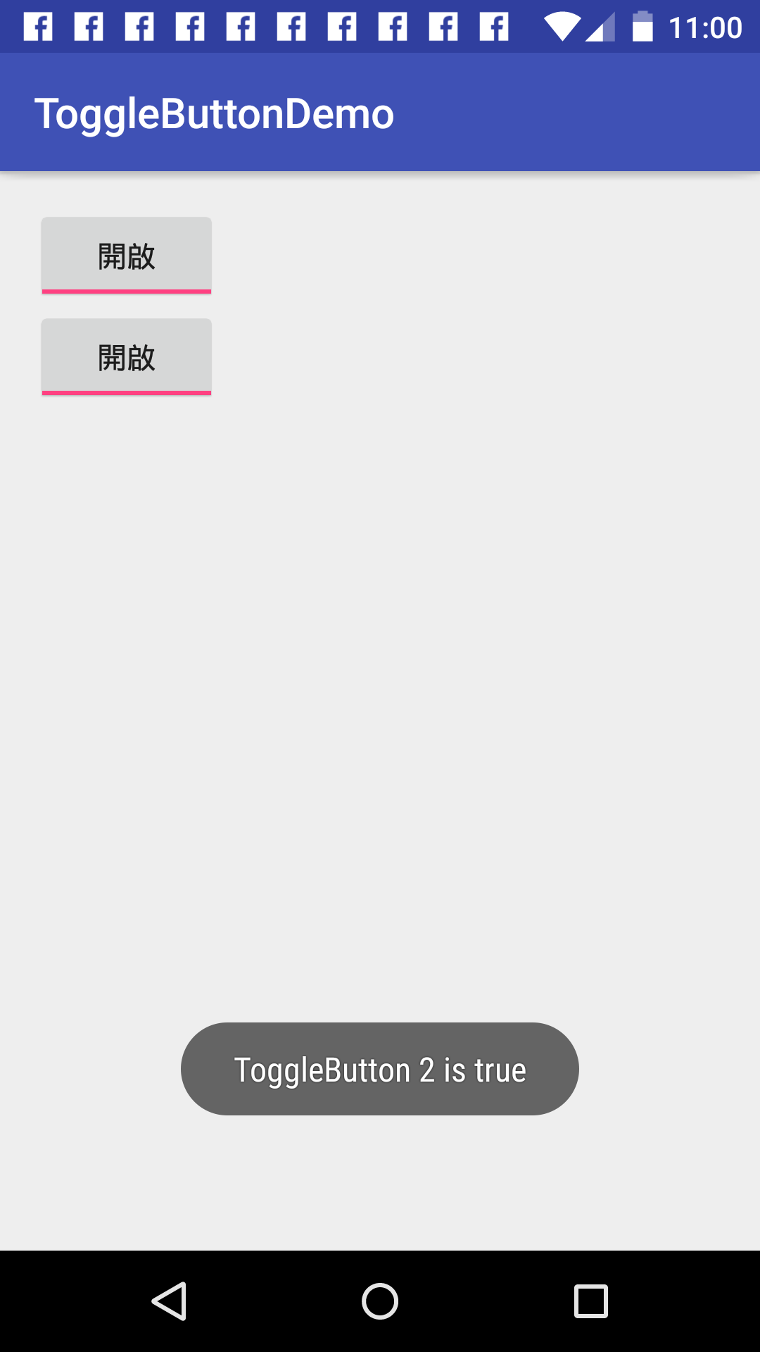
這次我們將事件宣告成一個成員變數,透過這個變數並且來實作事件內容,當設定好事件處理內容以後,透過 ToggleButton元件宣告,並且將事件指派給每個元件,就完成我們事件的設定了。
class MainActivity : AppCompatActivity() {
	private val mOnCheckedChangeListener = CompoundButton.OnCheckedChangeListener { buttonView, isChecked ->
		when (buttonView.id) {
			R.id.toggle_button1 -> Toast.makeText(this@MainActivity, "ToggleButton 1 is $isChecked", Toast.LENGTH_SHORT).show()
			R.id.toggle_button2 -> Toast.makeText(this@MainActivity, "ToggleButton 2 is $isChecked", Toast.LENGTH_SHORT).show()
		}
	}

	override fun onCreate(savedInstanceState: Bundle?) {
		super.onCreate(savedInstanceState)
		setContentView(R.layout.activity_main)
		toggle_button1.setOnCheckedChangeListener(mOnCheckedChangeListener)
		toggle_button2.setOnCheckedChangeListener(mOnCheckedChangeListener)
	}
}
如下圖我們可以看到無法是哪個按鈕被按下,所對應的事件都會根據我們所寫的呈現到Toast上面。
外觀設定
也許你會覺得 ToggleButton 長得也太醜了吧?
你會想要自己設定外觀,首先準備一個以下背景圖,可以從這邊下載Toggle Off。

接著在 xml 上面設定。
<?xml version="1.0" encoding="utf-8"?>
<LinearLayout xmlns:android="http://schemas.android.com/apk/res/android"
    android:id="@+id/activity_main"
    android:layout_width="match_parent"
    android:layout_height="match_parent"
    android:paddingBottom="@dimen/activity_vertical_margin"
    android:paddingLeft="@dimen/activity_horizontal_margin"
    android:paddingRight="@dimen/activity_horizontal_margin"
    android:paddingTop="@dimen/activity_vertical_margin"
    android:orientation="vertical">

    <ToggleButton
        android:background="@drawable/toggle_off"
        android:id="@+id/toggle_button1"
        android:layout_width="50dp"
        android:layout_height="30dp" />
</LinearLayout>
接著直接執行程式就可以看到下圖。
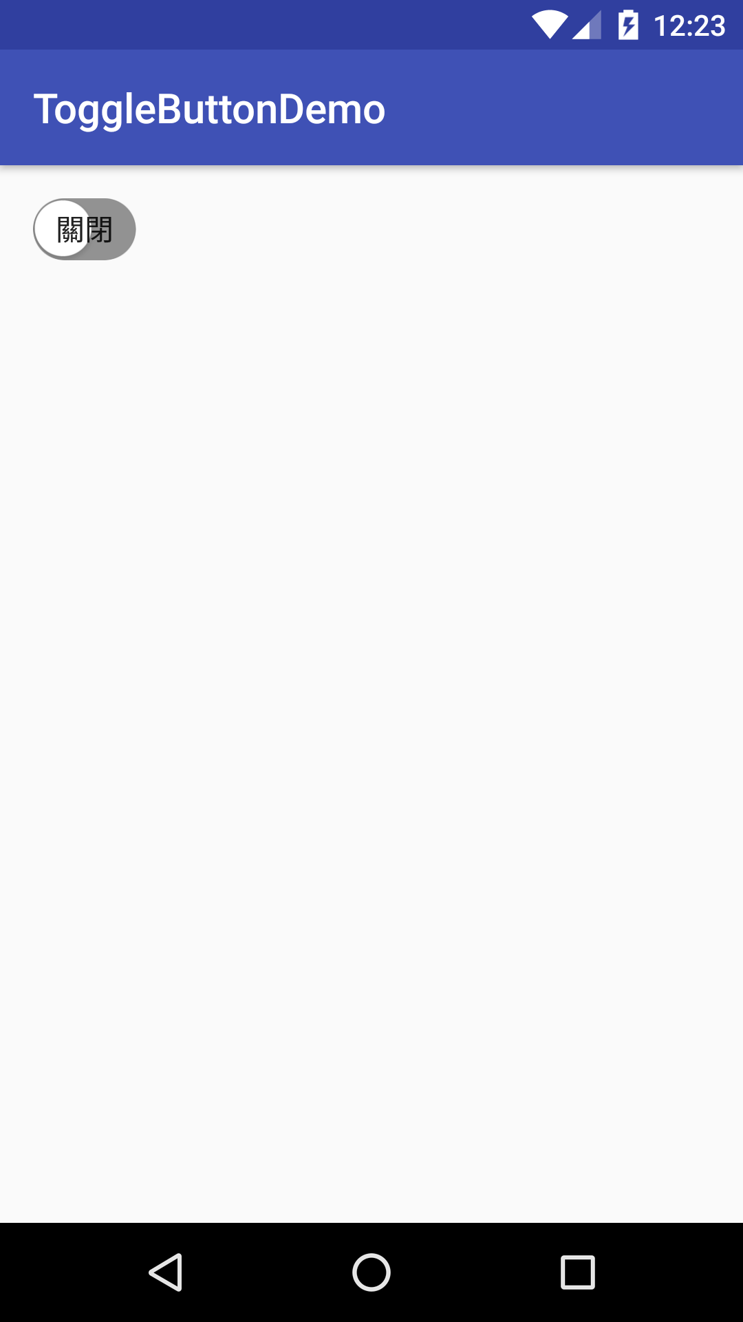
你會覺得奇怪,怎麼會有字,原來預設會有關閉跟開啟的字樣,所以我們要把預設字體拿掉,可以透過 android:textOff跟 androidtextOn 這兩個屬性設定。
<ToggleButton
    android:textOff=""
    android:textOn=""
    android:background="@drawable/toggle_off"
    android:id="@+id/toggle_button1"
    android:layout_width="50dp"
    android:layout_height="30dp" />
在一次的執行程式看看,果然畫面正常了,而且也是我們想要的外觀。
但是怎麼點擊的時候不能夠切換呢? 原來我們還需要另外一張圖,可以從這邊下載Toggle On。

並且把它做成 selector 的形式,從 Android Studio 內點選 res 右鍵,選擇 Drawable resource file。
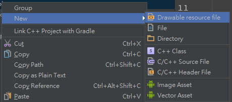
建立一個 toggle_button_selector.xml。
<?xml version="1.0" encoding="utf-8"?>
<selector xmlns:android="http://schemas.android.com/apk/res/android">
    <item android:state_checked="true" android:drawable="@drawable/toggle_on" />
    <item android:state_checked="false" android:drawable="@drawable/toggle_off" />
</selector>
接著在原本的 activity_main.xml 內修改 ToggleButton 的 android:background 屬性。
<?xml version="1.0" encoding="utf-8"?>
<LinearLayout xmlns:android="http://schemas.android.com/apk/res/android"
    android:id="@+id/activity_main"
    android:layout_width="match_parent"
    android:layout_height="match_parent"
    android:paddingBottom="@dimen/activity_vertical_margin"
    android:paddingLeft="@dimen/activity_horizontal_margin"
    android:paddingRight="@dimen/activity_horizontal_margin"
    android:paddingTop="@dimen/activity_vertical_margin"
    android:orientation="vertical">

    <ToggleButton
        android:textOff=""
        android:textOn=""
        android:background="@drawable/toggle_button_selector"
        android:id="@+id/toggle_button1"
        android:layout_width="50dp"
        android:layout_height="30dp" />
</LinearLayout>
如此一來你就可以看到我們自訂外觀所需要的效果。
這樣就是一個簡單的 ToggleButton 的操作。